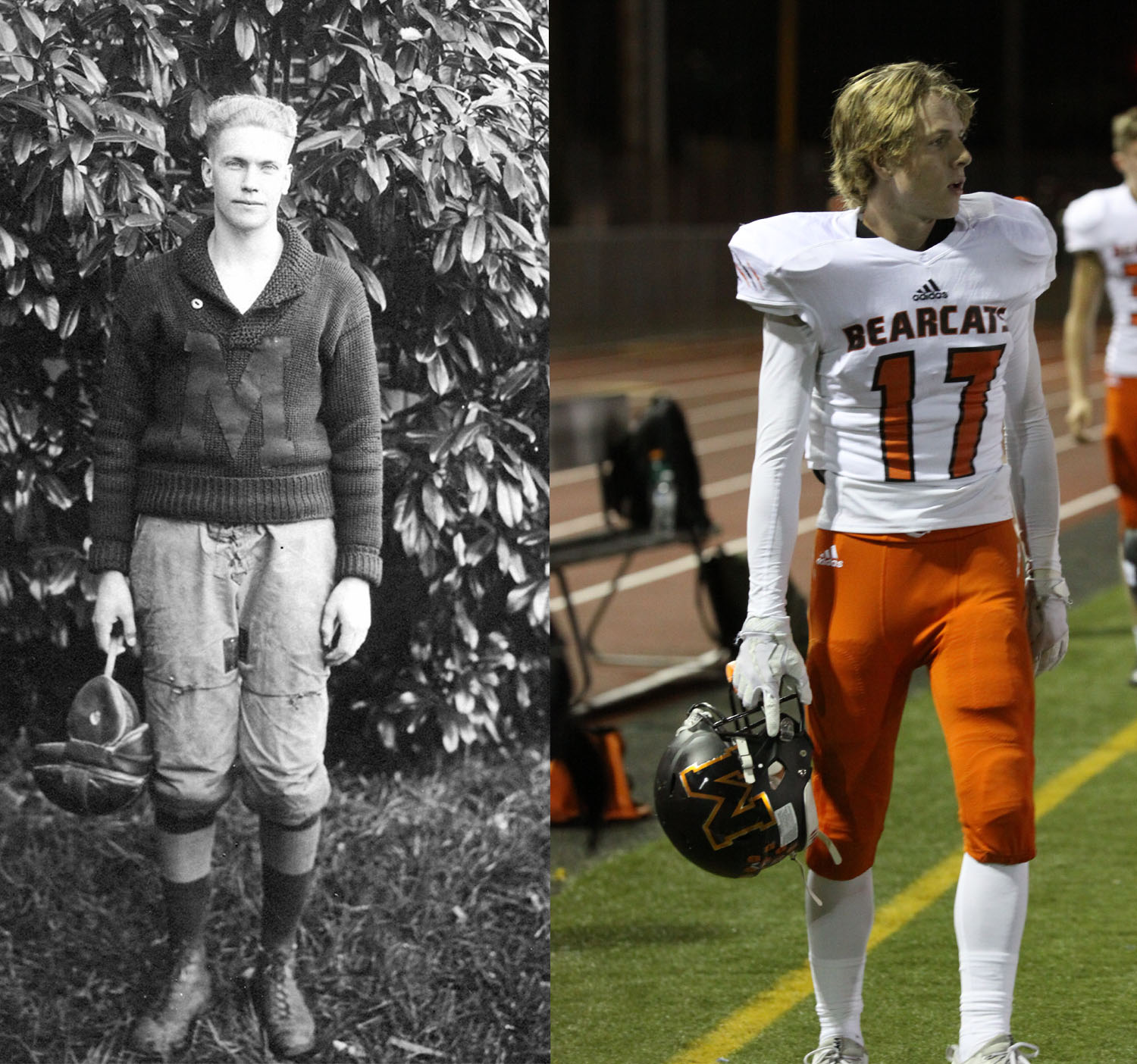
Henry A. Dennis in 1920 side-by-side with Brett Silvey in 2018
Published on September 8, 2020
In our modern society, popular fashion styles are seldom constant as new trends come and go like the changing of the seasons. This change is not just seen in the world of fashion, it can noticeably be seen occurring in football. While changes to offenses and rules are what come to mind when thinking about progress in the sport, football uniforms have undergone the most dramatic and noticeable evolution in the long history of football. Since 1911, the attire of the Monroe Bearcats has undergone consistent changes as photographs detail each alteration in every era of Bearcat football. In analyzing pictures over the decades, one can see how changes in style and a growing emphasis on player safety culminated into the modern uniforms of today.
Simple Beginnings (1911-1936)
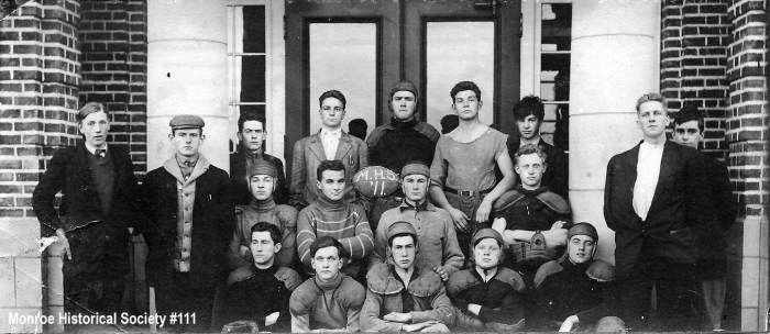
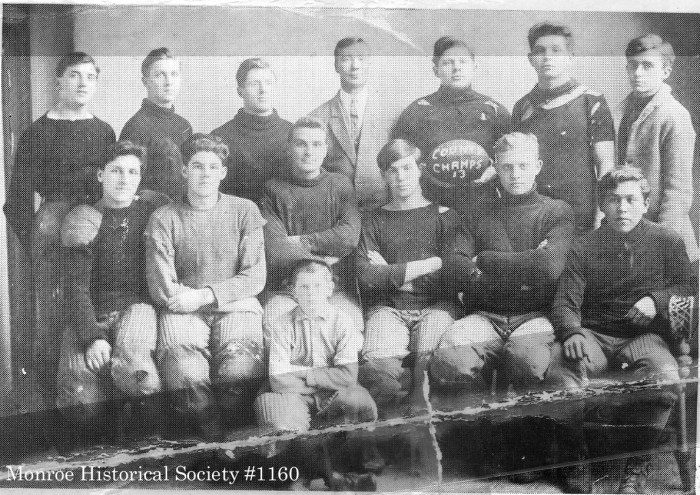
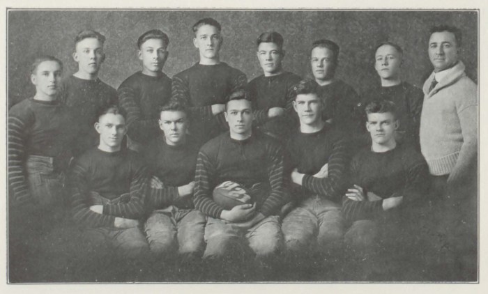
The first photograph of Monroe football is a team photo from 1911 that shows how bare-bones and simple the dress was in the early years of the sport. There does not appear to be a uniform for the entire team as the outfits are different between players. The equipment, such as the leather helmets and padding, is minimal as only the shoulders and legs are padded. This minimalism for protection persisted for many years and any changes in uniform were largely only visual. A few years later in 1916, the players appeared to be outfitted with dark sweaters and cleats.


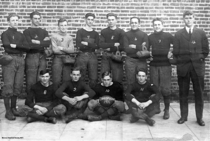
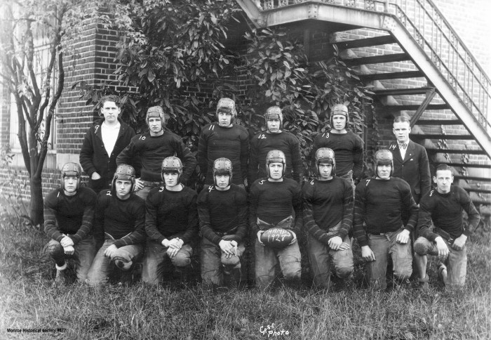
By 1920, the style changes slightly as a picture of Henry A. Dennis shows him wearing a thick sweater with an ‘M’ sewn onto the front, the first evidence of a logo in use for the team. A year later in 1921, the uniform changes once more. Instead of an ‘M’ on the front, the team reverted back to a thinner sweater with light stripes, presumably orange colored, on the arms. This style persisted throughout the 1920’s, lasting until 1931 when another stylistic change took place. For the 1931 team, the players were outfitted with a lighter colored uniform with a large ‘M’ on the front and black stripes on the arms. This uniform did not last very long and was soon replaced with a more familiar look by 1937.
The classic ERA (1937-1961)


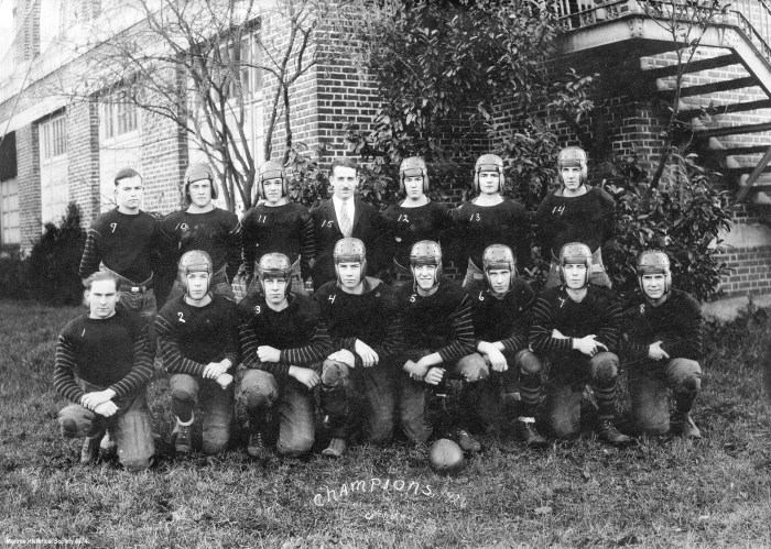
For this uniform, the players are clothed in a black sweater with numbers on the front, likely colored orange. In terms of player protection, shoulder pads became noticeably larger during the late 1930’s. Helmets were still basic and made of leather, granting little protection for players. In 1945, yearbooks show the players in a different white uniform, likely the first documented instance of an away uniform. The uniforms and helmets were very lightly colored with black numbers in contrast. After a decade of usage, the Bearcats moved on to a more refined uniform.
In 1947, the light uniforms were replaced by a more refined, modern look with black uniform and bold orange numbers. This was also the first uniform to include a brand new helmet that was constructed out of plastic, a design that was first brought about in 1939 by the famous John T. Riddell. The design offered was a massive step forward for player safety and improvements were slowly phased in as time went by. This 1947 updated uniform also included new away jerseys that were lighter with black numbers.

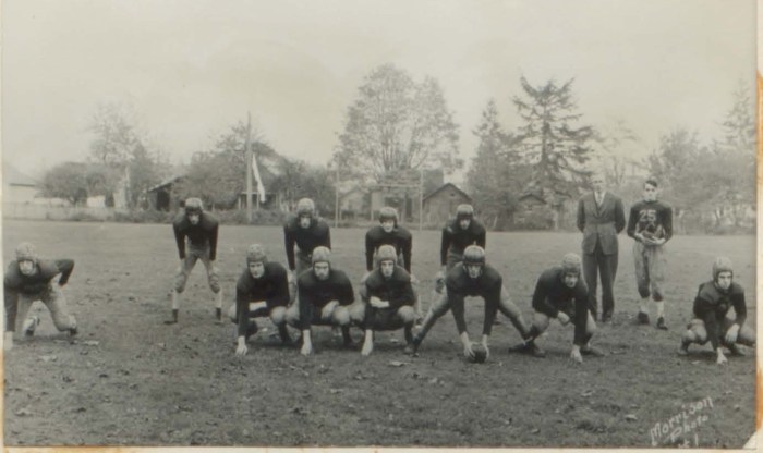
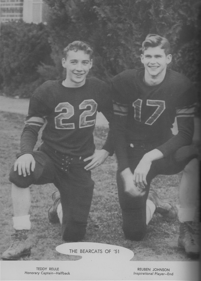
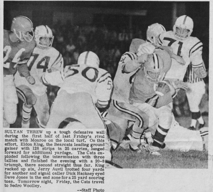
Though the team had drastically upgraded its uniform design, updates to the style were frequent in the 1950’s and took place after only a few seasons. The new uniform that was introduced in 1952 featured an orange jersey with black shoulders, black stripes on the sleeves, and an orange line down the pants. This look persisted through most of the 1950’s and saw another major improvement in player safety. Though helmets became increasingly sturdy, the emergence of the facemask took longer to catch up. Facemasks saw their introduction in 1956, but seemed to be in limited use and only consisted of one bar for protection. In 1957, the team issued out a new uniform that did not immediately replace the 1952 version. This update featured a much simpler design, all black jerseys and pants with no other stylings present. It also featured an updated facemask design that replaced the white bar with a larger, clear bar that offered much greater protection.
Introducing Logos and Modern Padding (1962-1980)
As the decade turned to the 1960’s, another update to the Bearcat uniform was not far. By 1962, Monroe rolled out another complete stylistic and protective update that went on to define the decade. For the home uniforms, the jersey was orange with black numbers, pants, helmets, and black and white stripes on the shoulders. Though these were the home uniforms, the away jerseys were featured more prominently in photographs and featured white uniforms with the stripes on the shoulders. The helmets were also updated, now featuring two bars on most of the helmets and some also having a bar going down between the eyes, a look that was phased in over the course of the next few years. This particular style lived on until 1969 when a new uniform was introduced, but the old uniform continued to see service into the 1970’s.
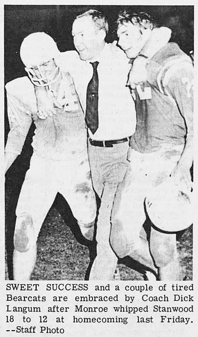
The new uniform that was introduced in 1969 was a slight change as opposed to a radical redesign. The numbers on the front of the jersey were white and the black pants were replaced with white ones. On the arms of each jersey were numbers and the shoulders retained orange and white stripes. This uniform saw usage for most of the 1970’s with a few changes in between. In 1971, the helmets also received an updated look as they were now orange or white and had orange and black stripes going over the top of the helmet. The following year, the jersey received a minor update as the shoulder stripes were moved further down the arms. Until 1976, this was the standard look for Bearcat football until more modern styles were included.
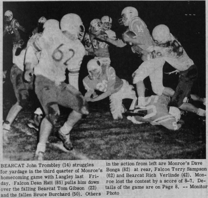
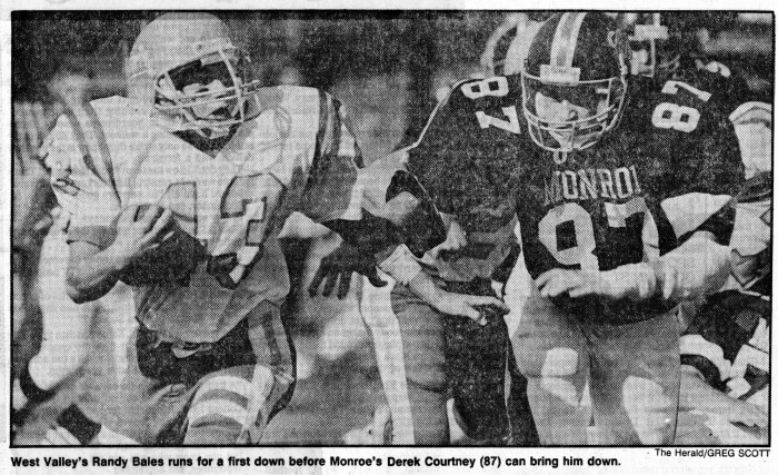
In 1976, the first instance of logos on the helmets were seen Monroe players had a white ‘M’ on the side of their helmet. The next season, the away uniforms received an updated look as the numbers were made black and the arms now sported an orange ‘M’. The helmet also saw another change as it was made black and the ‘M’ was replaced with a skull and crossbones logo. By 1978, the home uniform was updated to a simple black jersey with orange numbers and the pants featured orange, black, and white stripes going down the sides. Though many small updates were made, parts of this uniform saw usage until the 1990’s.
Golden Age in the 1980’s (1981-2000)
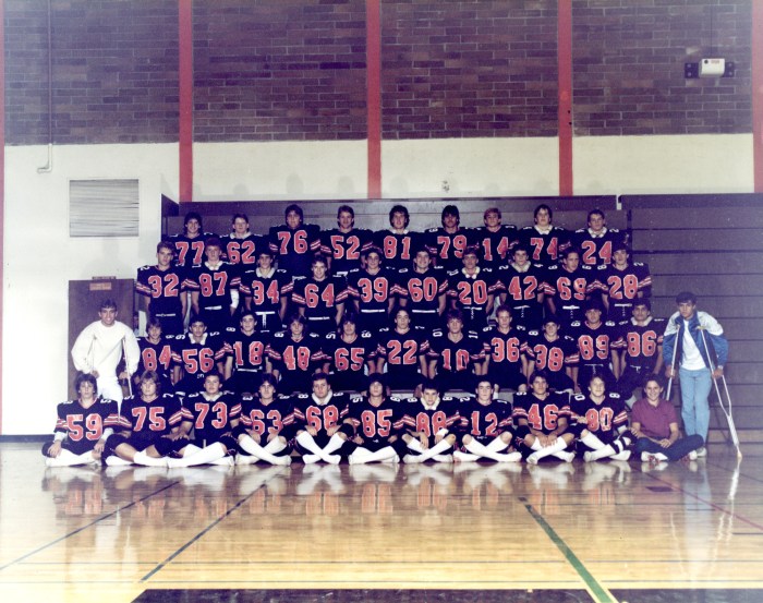

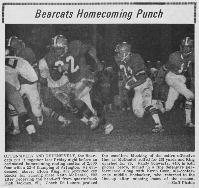
The 1980’s were an important decade for the Bearcats and their attire was similarly strong, maintaining a consistent and attractive look well into the next decade. By 1981, the team adopted a new jersey and helmet combination that revamped the uniforms. These jerseys were updated with bigger numbers on the front, numbers on top of the shoulder pads, as well as orange and white stripes on the arms. The helmets received a new logo that read “‘Cats” on the sides, the script being inspired from the California Bears logo. The distinctive orange and white stripes also made a return for these updated helmets. In some instances, the team used a simple ‘M’ logo on the helmet, but this was featured in limited action.
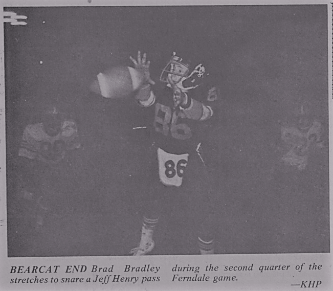
For player protection, the shoulder pads became greatly enlarged. Though shoulder pads had grown in size since their introduction, the shoulder pads that emerged in the 1980’s gave players a hulking look. To accommodate the large pads, the jerseys were mesh and loose fitting, adding to Herculean appearance of the players. This uniform largely remained the same for the rest of the decade, receiving only minor updates in the following years. In 1987, the numbers on the front of jerseys were made smaller and “MONROE” was written above the numbers. In addition, white pants with black and orange stripes were put into greater usage. This uniform persisted into the 1990’s, seeing usage as late as 1992.
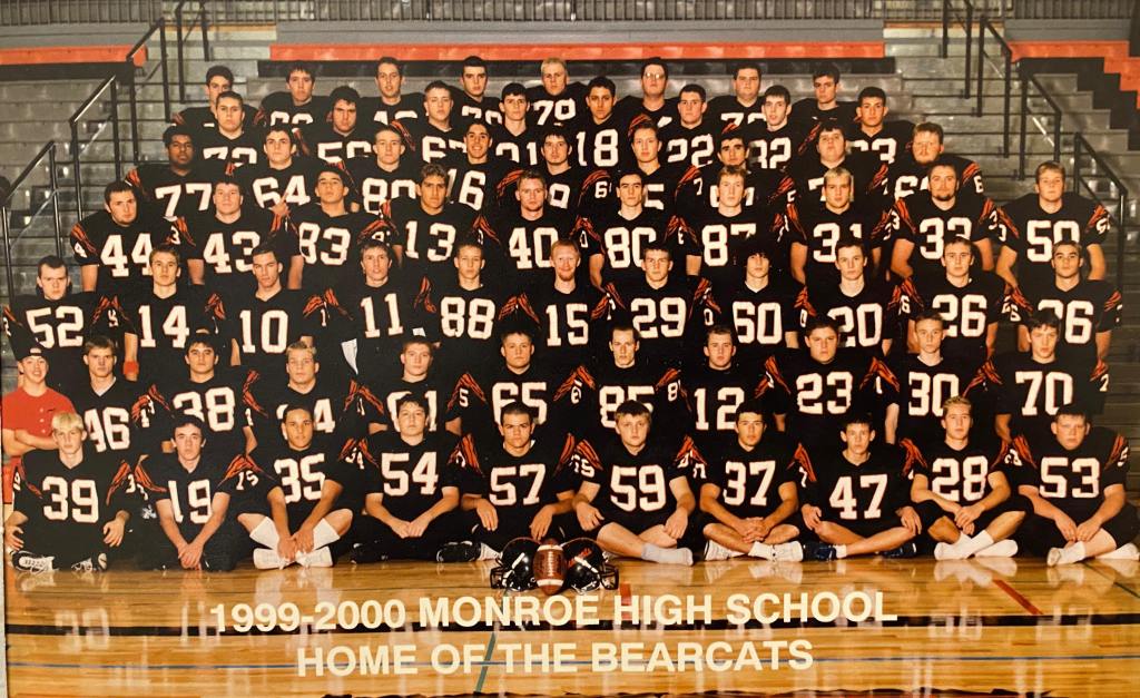
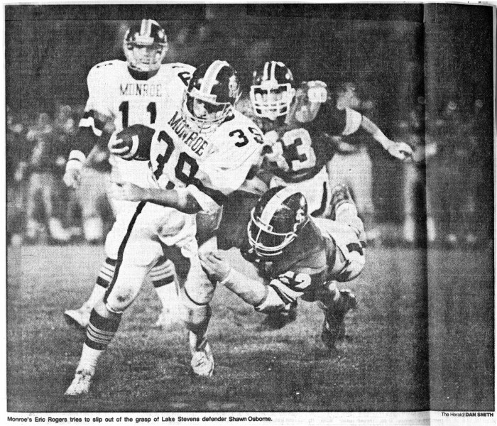
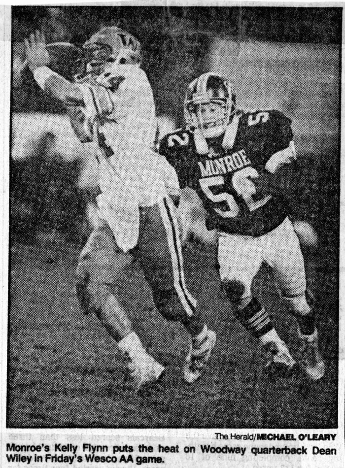
While this classic uniform ranks among the best even donned by the Bearcats, the time for a replacement came in the mid-1990’s. This new design was seen as early 1994 and was much more plain than previous uniforms. The home jerseys were black and featured large white numbers on the front and smaller numbers on the sleeves. Orange stripes covered the shoulders and simple black pants were worn, making for a much more subdued uniform. The logo on the helmets was ‘Bearcats’ written in a cursive script and were only seen on the left side of the helmet. An orange stripe that went down the middle of the helmet was also used. This simple uniform saw service through the remainder of the 1990’s and was used as late as 2000. Bearcat media from the 2000’s scarce to find so it is unknown how long this uniform lasted until it was replaced.
Missing the Mark (2000’s-2013)
Though exact dates are unknown and photographs are scarce, the next uniforms worn by the Bearcats can still be seen. Found in a video from 2007, the home uniforms for the Bearcats were some of the weakest in program history. The jersey is orange with black numbers on the front, as well as black and white stripes on the sleeves. The pants were white with a large orange stripe running down. The helmets were styled after those worn by the Michigan Wolverines, black with orange stripes going down the helmet. It is not known how long these uniforms were worn but the 2007 season saw their last usage.
With the all-orange jerseys disposed of, the Bearcats went with a brand new style in 2008. Instead of the orange, the home jerseys were black with a small orange and white stripe going across just below the shoulders. The numbers that appeared on front, back, and shoulders were white and the script used was in a more cursive style. Above the numbers on the front was ‘Bearcats’, written in cursive. The pants were black and the Michigan Wolverines-styled helmets remained unchanged for at least the 2008 season. By this time, the large shoulder pads of the 1980’s were gone and had become progressively smaller as time went on. This uniform lived on until 2013 and saw only minor updates to the helmet in that time. In 2010, the helmet was made completely black with no logo at all. The following season, the helmet was given orange and white stripes going down the middle of the helmet and an orange ‘M’ logo on both sides. This ‘M’ once again was styled after the Michigan Wolverines, using the same style ‘M’. Though this uniform was an important stop-gap for the program, the Bearcats soon replaced it after receiving a new outfitter, Nike.
Monroe becomes modern (2014-Present)


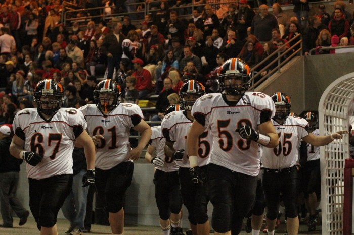
In 2014, Monroe High School agreed to be outfitted by uniforms made by Nike, marking a massive step forward to the cutting edge of football uniforms. Despite the new partnership, Monroe still relied upon the previous uniforms during home games as the new Nike outfits appeared in only away games. For the away games, the team wore white jerseys with either solid black pants or white pants with a large orange stripe on both legs. For the jersey, orange numbers appeared on the front, back, and sleeves and ‘CATS’ was written above the numbers on the front. The helmet, which was unchanged from 2014 to 2015, was black and had a small, black ‘M’ logo displayed on both sides. With the start of the 2015 season, the Bearcats at last had their new home jerseys, which were simply black versions of the away jerseys. During 2015 home games, the Bearcats exclusively wore an all-black uniform and alternated between previous away combos from 2014.


Though the Nike-era would be short lived, 2016 marked another leap forward for Monroe uniforms. With the first two seasons seeing slow changes, Monroe’s final season with Nike saw many improvements to the uniform design. The helmet, which was made by Riddell, was completely revamped to the latest modern design. The ‘M’ logo was also revamped to a superior design, featuring a bright orange outline of the letter. The home black jersey was changed, now featuring white sleeves and was paired with black or white pants during home games. As the 2016 concluded, Monroe looked for a new outfitter and settled on another strong choice for the 2017 season.
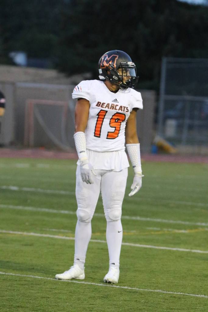
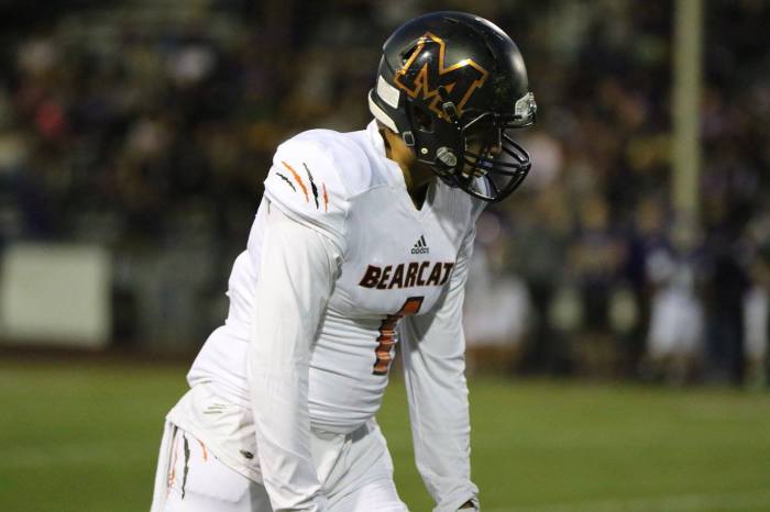
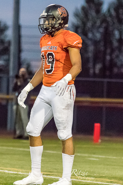
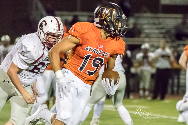
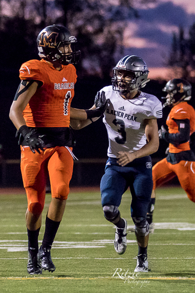
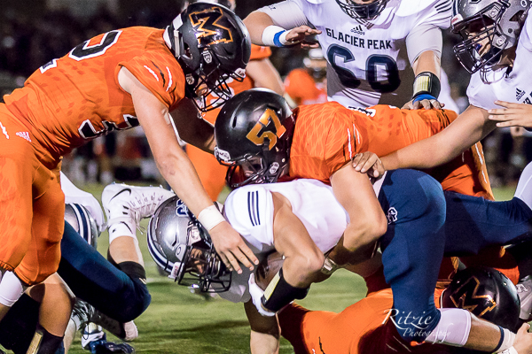
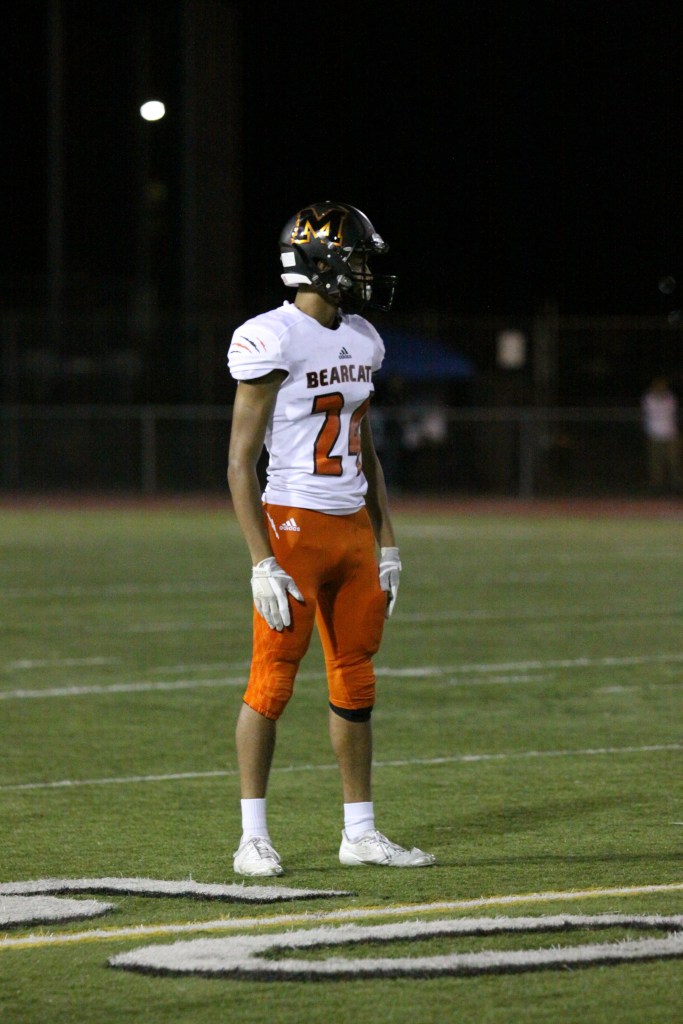
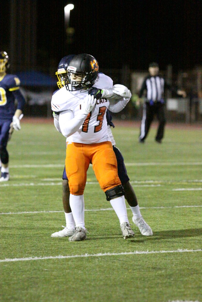

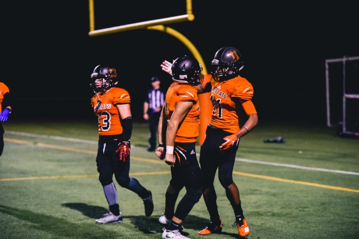
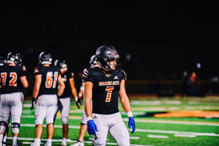
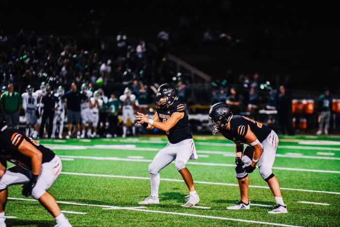
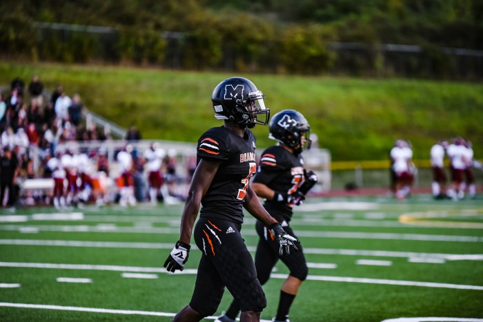

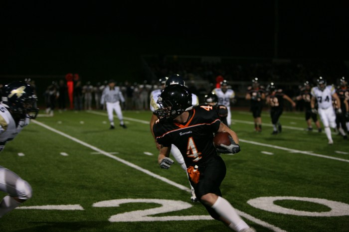
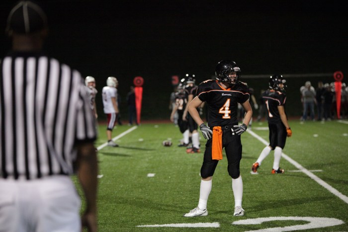
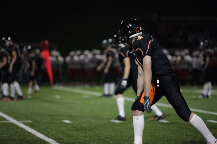
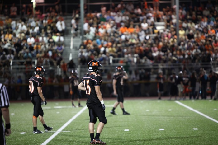
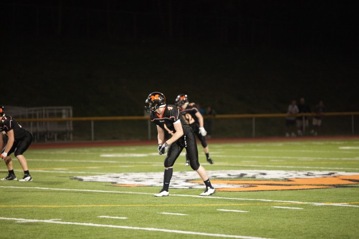
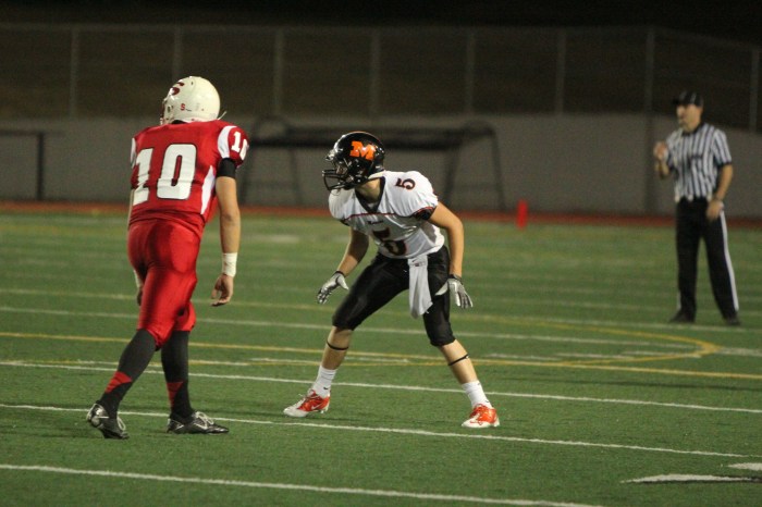
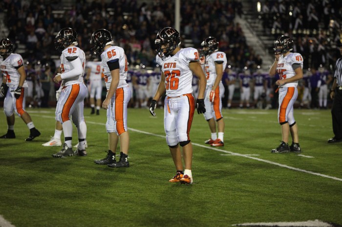
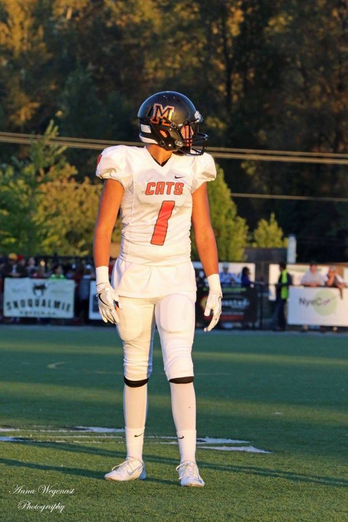
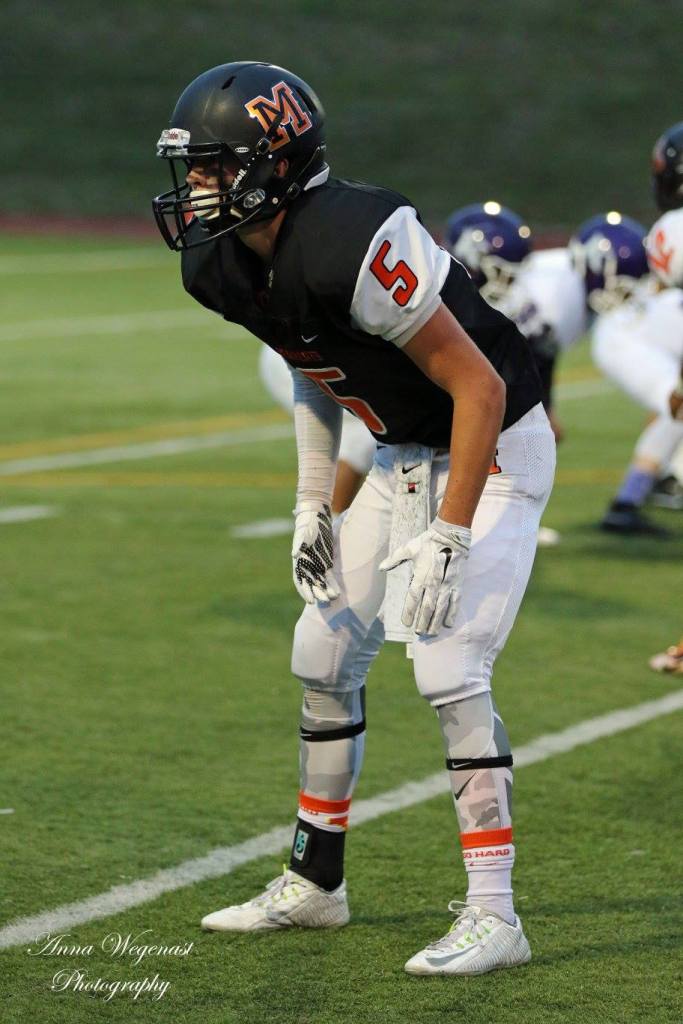
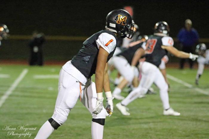
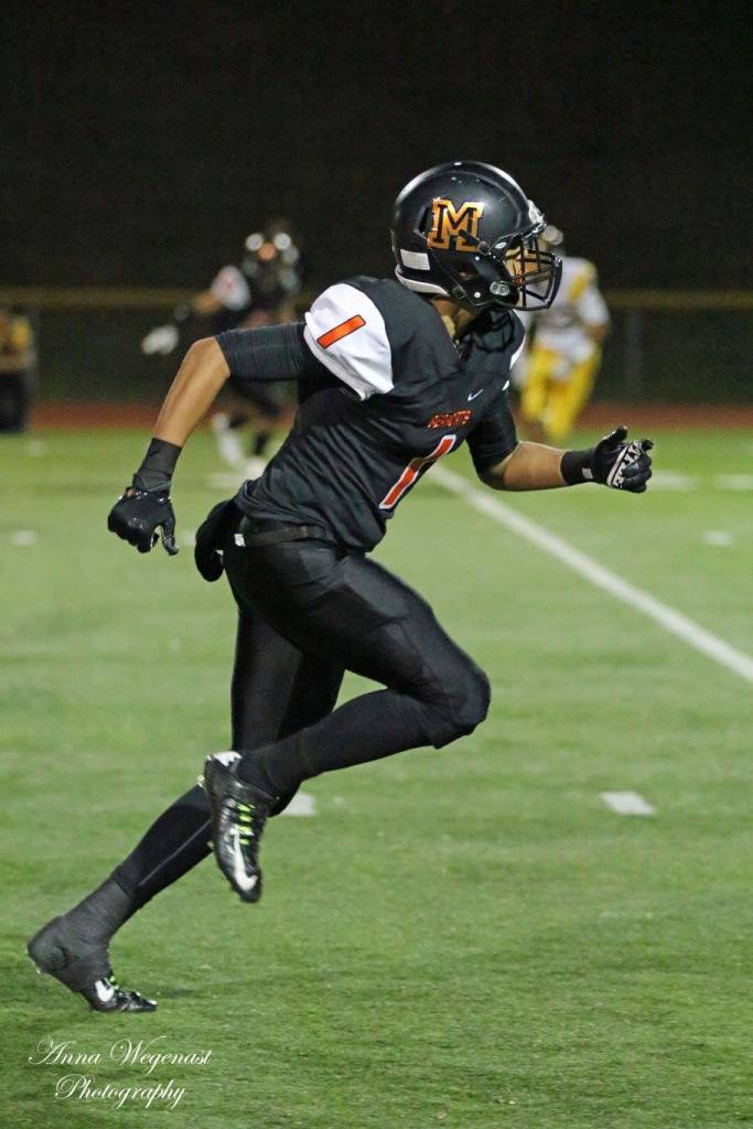
Since 2017, the Monroe Bearcats have been outfitted by Adidas, another major sportswear company that competes with Nike in the big business of football uniforms. Every year since 2017 has seen additions to the uniforms, making the current designs some of the best the program has seen so far. The initial jerseys were limited to white for away games and orange for home games with either white or orange pants. The numbers were placed on the front and back and were colored either orange or black depending on the jersey. The word ‘BEARCATS’ was placed above the numbers on the front of the jerseys and black and orange claw marks were put on the sleeves and sides of the pants. The helmets had a large, orange ‘M’ on the right side, styled once again after the Michigan Wolverines logo. On the left side of the helmets are the numbers for each player, colored a bright orange. In 2018, black pants were added to the uniform and in 2019, black jerseys were finally added to the repertoire, giving the team the sought after all-black uniforms. The jerseys are sleek and form fitting, a far cry from the baggy mesh jerseys of the 1980’s, but still have problems of their own. “Players can’t wear their uniforms to school because they’re so tight on them,” quipped Coach Scott Darrow when referring to the tightness of the new jerseys. Though players look smaller than in previous days, player protection remains a top priority. Advances in protection has made the padding smaller, giving players a smaller frame on the gridiron. With small padding and the tighter fitting uniforms, players mobility is increased without sacrificing protection.
Conclusions
After 109 years of football, the uniforms worn Monroe Bearcats have gone through numerous changes through the years. In looking through photographs over the decades, the viewer can see how shifting aesthetic tastes and the growing importance of player protection have been the key driving forces in changes. New trends and innovations have both contributed to continuous improvements in how players look and feel. From the bare-bones outfits of the 1910’s, uniforms gradually evolved into the hulking shoulder pads and mesh uniforms of the 1980’s. This eventually gave way to the sleek, tight-fitting uniforms of the modern day that offer the best in protection and mobility. Time will tell what new uniforms will be seen in the future but it is certain that advances in protection and new styles will be remain the two forces driving change in the years to come.
Acknowledgements
We’d like to thank and cite the sources for the photographs seen in this article, without their work this article simply could not be completed. To see more photographs, please visit the ‘Photographs’ section to find pictures and larger images of the ones seen here.
Until the 1980’s, many of the photographs were found in the Monroe Monitor newspaper and Monroe High School yearbooks. These and other one-of-a-kind vintage photographs were found thanks to the Monroe Historical Society, we highly encourage visiting them to learn more about Monroe history. The photographs seen in the 1980’s and 1990’s are courtesy of Kurt Nowadnick and Andre Wyatt. Pictures of the uniforms from the 2000’s and the first iteration of the Nike uniforms were provided by the Monroe School District. Anna Wegenast Photography can be seen in the following slideshow of Nike uniforms are for some of the Adidas uniforms. Photos from Ritzie Photography and Striped Hat Photography make up the remainder of the Adidas slideshow. We strongly suggest visiting their respective pages to support local photographers. Without their generosity and hard work, this article and website would not be as polished as it is today.
